Colors
The Role and Application of Color Schemes
The color palette is a defining element of duisport. It is bold, vibrant, and eye-catching, ensuring a consistent, recognizable look across all media.
The defined color references must be used consistently when designing print and digital applications.
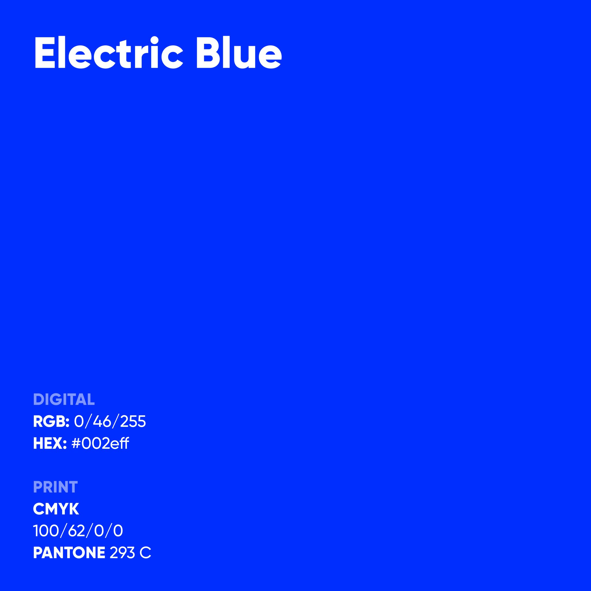
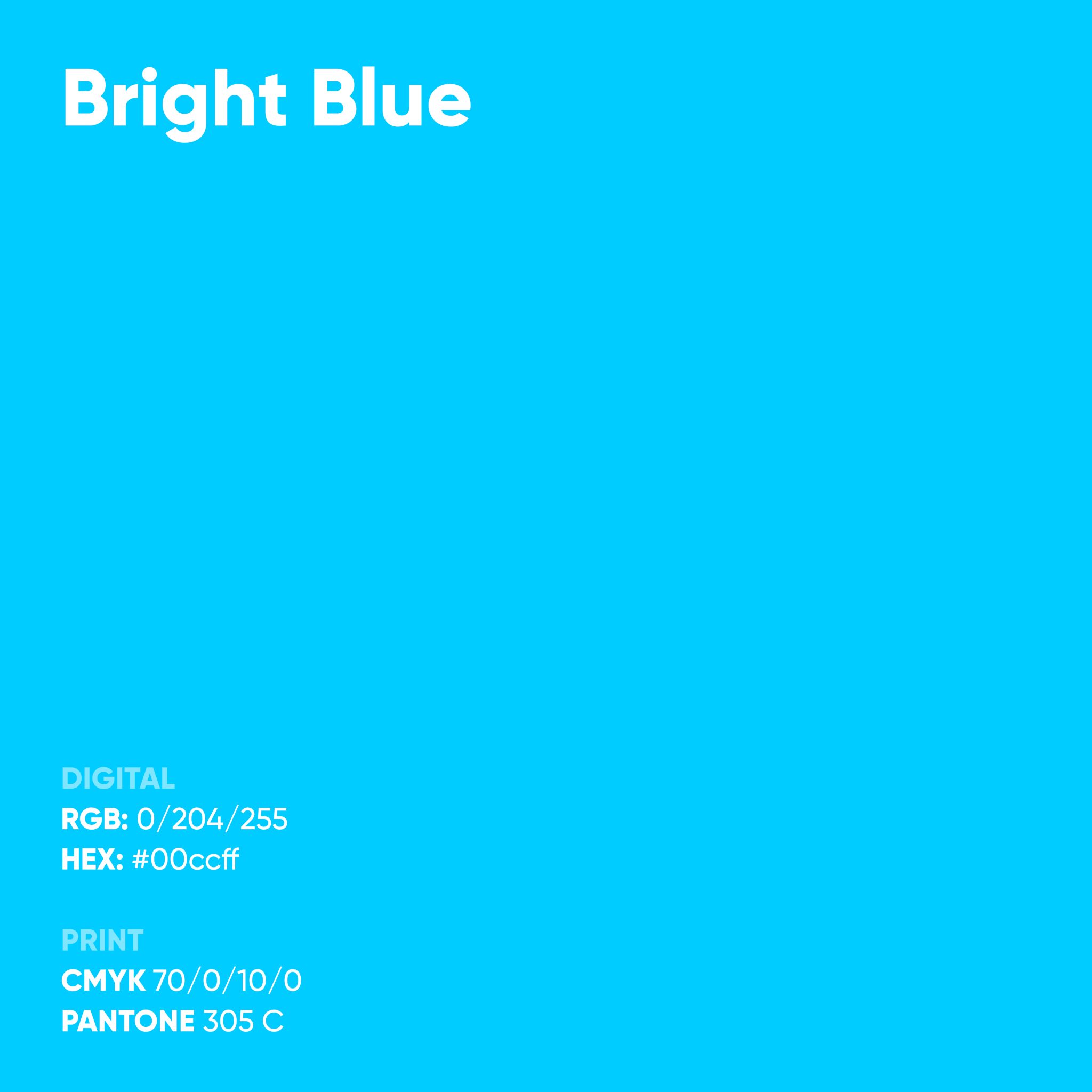
RGB is used for all digital applications, such as websites, presentations, online banners, and social media.
HEX are simplified representations of RGB values and are used in web development and coding.
CMYK is the standard for all printing applications. The color values ensure reliable and cost-effective reproduction of brand colors in print. Compared to digital displays and Pantone colors, the colors appear less vibrant.
Pantone is the industry standard for highly accurate color reproduction in print. Whenever possible, Pantone colors should be used, as they achieve a level of brightness comparable to that of RGB colors. However, Pantone is not mandatory for standard print productions.
Primary color
Electric Blue is duisport’s primary brand color. It symbolizes clarity, precision, and digital strength, and plays a key role in shaping the brand’s visual identity. This shade should be used as the primary color across all media.
Secondary color
Bright Blue is duisport’s secondary color. It complements Electric Blue and reinforces the brand’s impact by creating additional contrasts. This shade is used across all media to complement the primary color and is subordinate to it.
Tertiary color
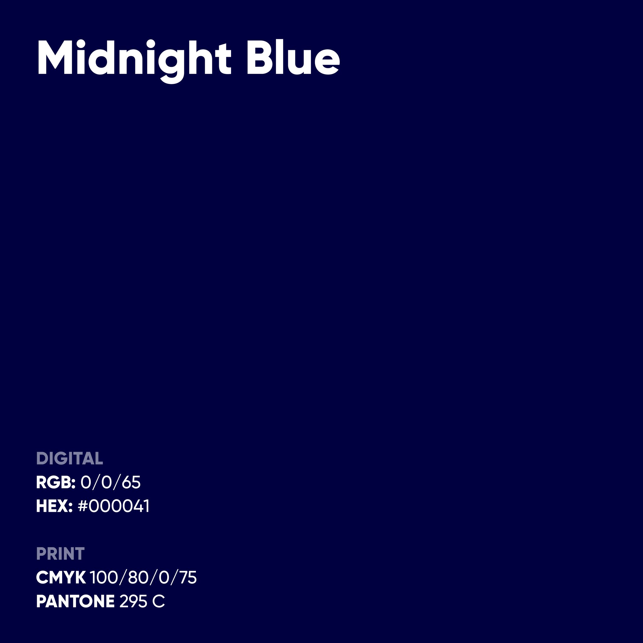
Midnight Blue is used primarily when a calm, understated effect is desired—for example, at high-end events such as galas.
Accent color
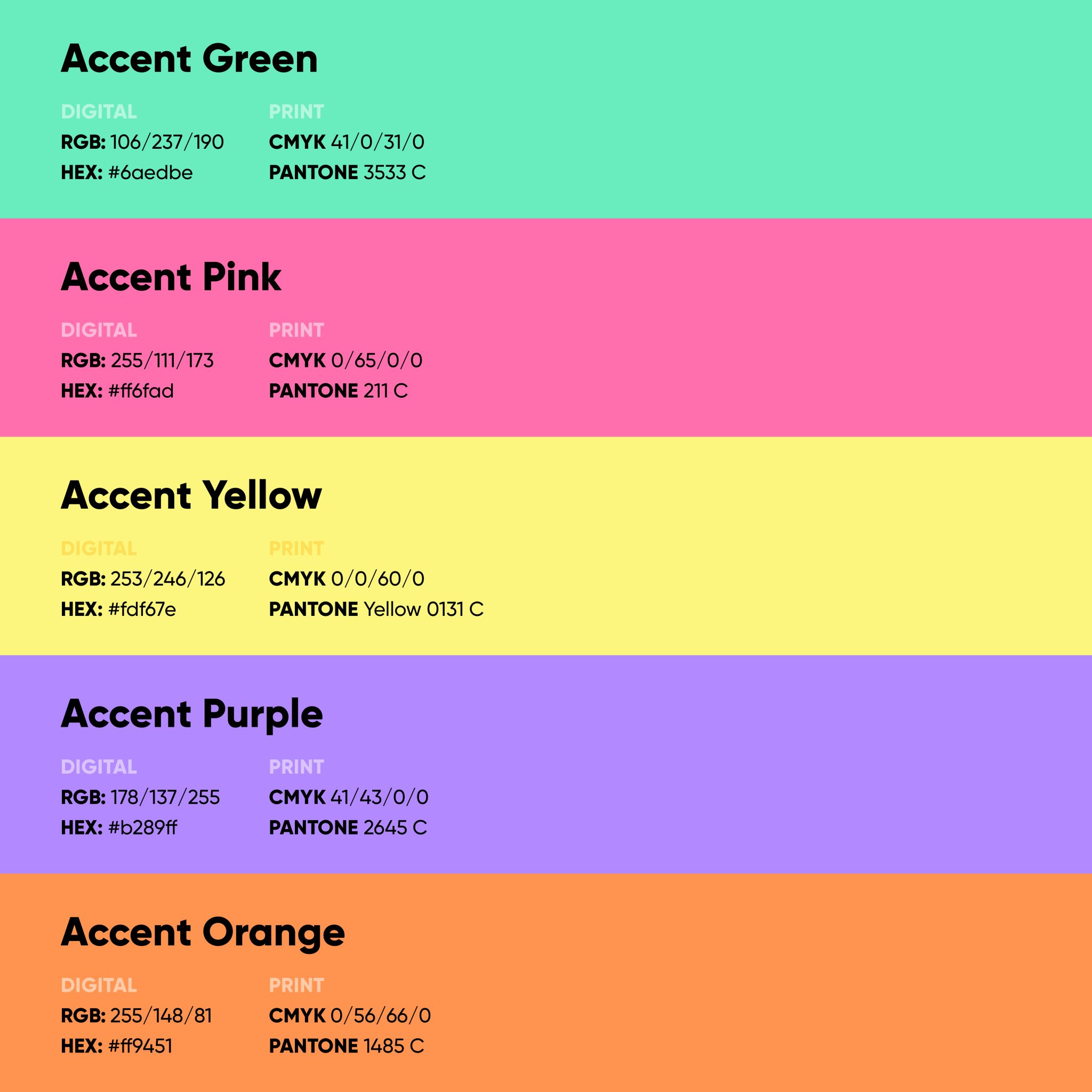
The five accent colors are used sparingly on smaller elements such as charts, icons, or highlights. In HR and social media contexts, they may be used more extensively, but they account for no more than 20–30% of the layout and take a back seat to the primary, secondary, and tertiary colors.
Text and Background Colors at a Glance
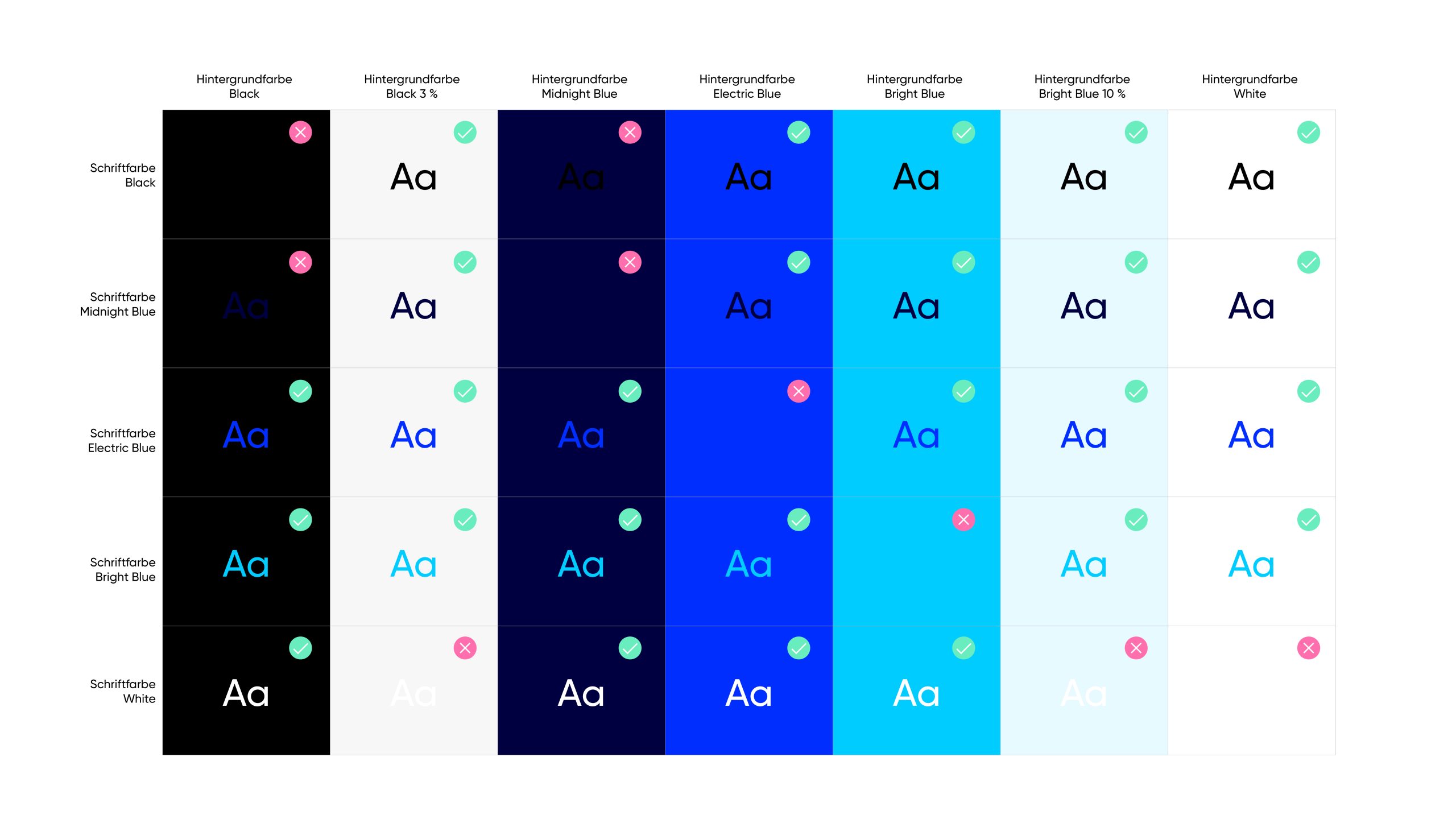
Which text color can be used on which background? This table provides guidance on the correct combination of text and background colors. It helps ensure that the design guidelines are applied correctly and that content remains clearly legible at all times with sufficient contrast.
Black 3% and Bright Blue 10% expand the design possibilities within the duisport color palette by adding subtle, calm backgrounds that are suitable, for example, for subtly delineating white areas.
Use of the Color Gradient
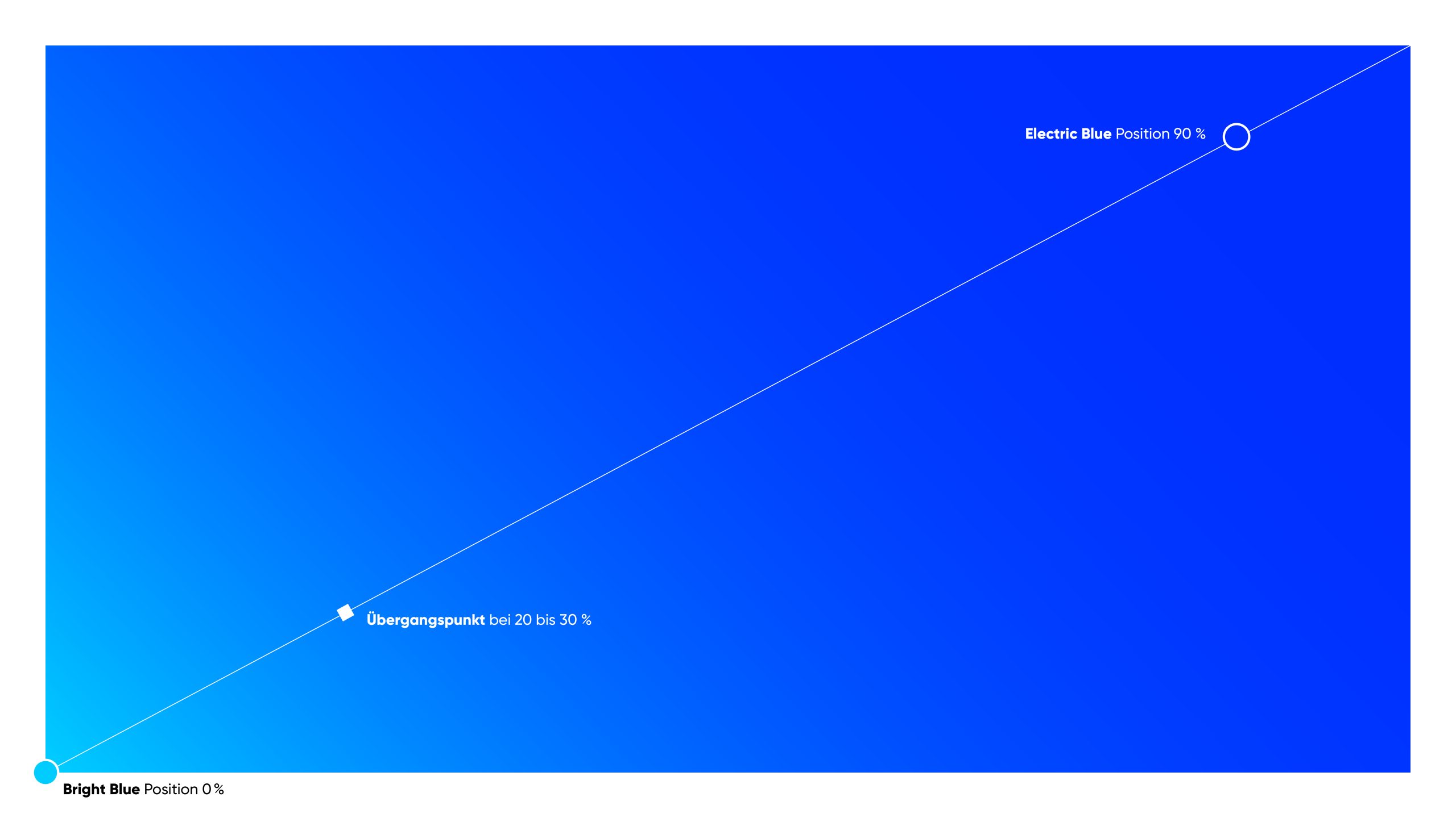
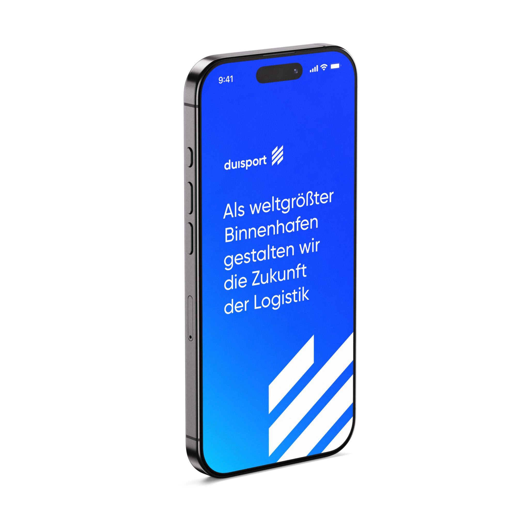
The gradient is a complementary design element within the duisport color palette. It combines Bright Blue and Electric Blue into a dynamic color field and is used, for example, over large areas for backgrounds or buttons.
The diagonal gradient starts at 100% Bright Blue and transitions smoothly to 100% Electric Blue. A guideline of 20 to 30% marks the transition point between the two colors, ensuring that Electric Blue always remains the primary color in the gradient.
The gradient is diagonal. It typically runs at a 45-degree angle from one side of the frame to the opposite side. The starting point of the gradient is flexible; what matters is the diagonal orientation. In narrow or unusual formats, the angle can be adjusted as long as the character of the gradient is preserved.