The duisport logo is the brand’s central visual identifier. It represents the Port of Duisburg as a high-performance logistics hub, industrial expertise, and reliability within complex structures.
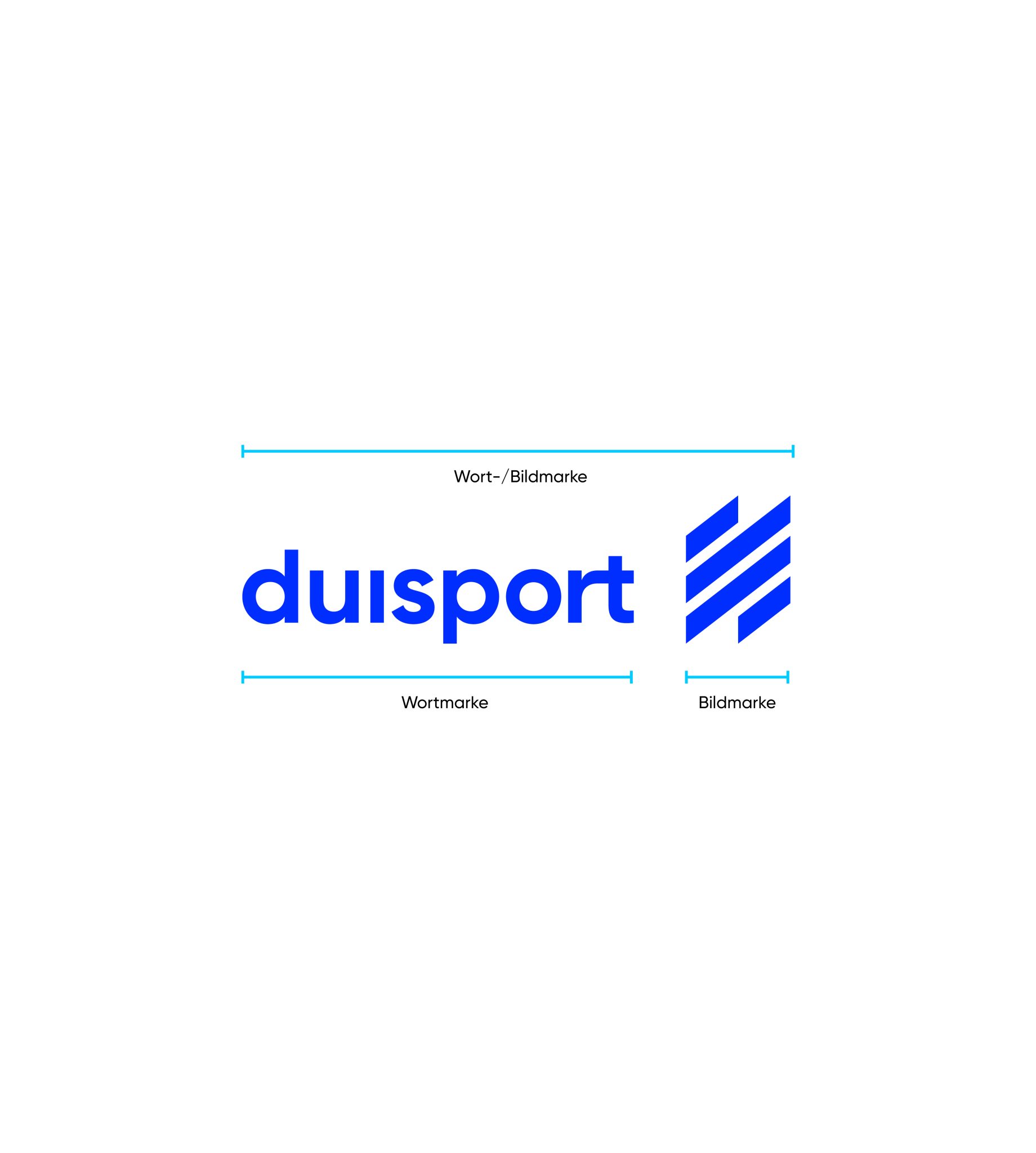
The logo is designed as a word and figurative mark and consists of the word mark “duisport” and the figurative mark in the shape of a diamond.
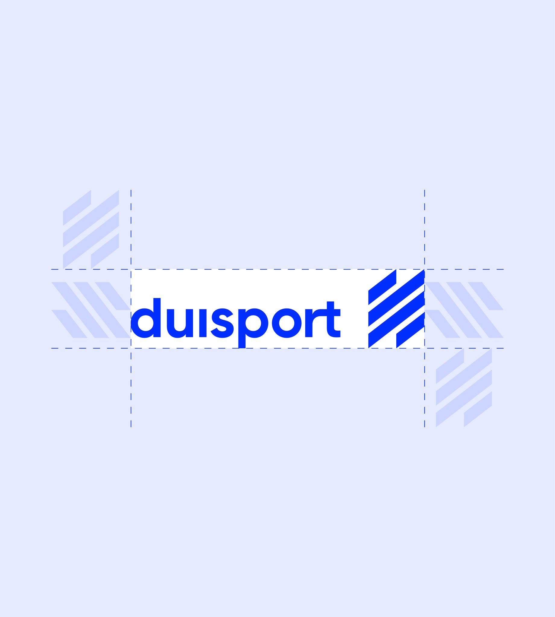
The protection zone ensures the logo’s clear impact and prevents visual interference from other elements. No text, images, or graphic objects may be placed within this area.
The diamond-shaped figurative mark serves as the reference: The minimum clearance around the logo is equal to the height of the diamond. This clearance must be strictly observed in every application.
Word and figurative marks in their defined combination
Protection zone around the logo
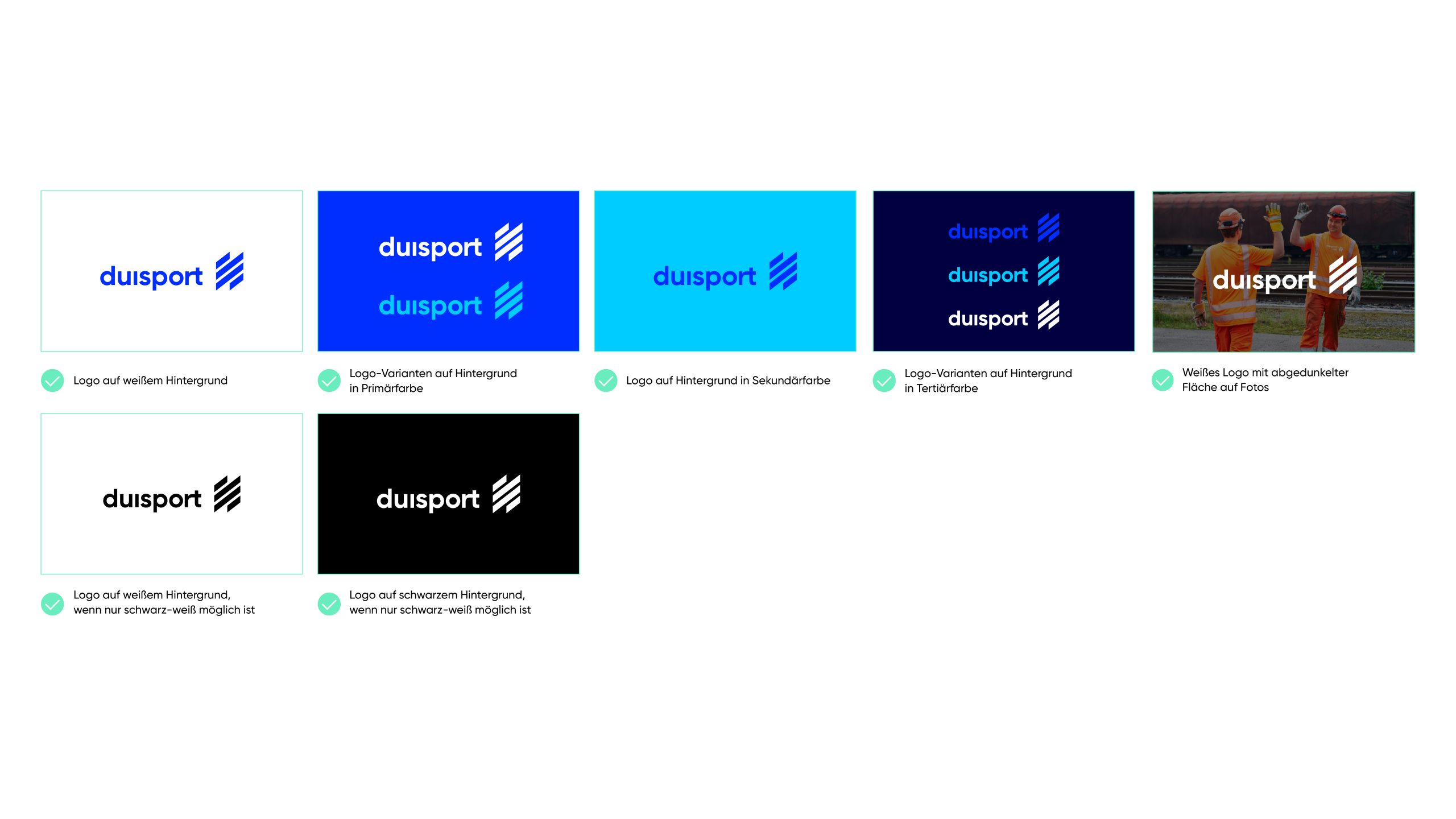
Dos
The logo must always be used in the original versions defined here. The proportions, colors, and spacing must remain unchanged.
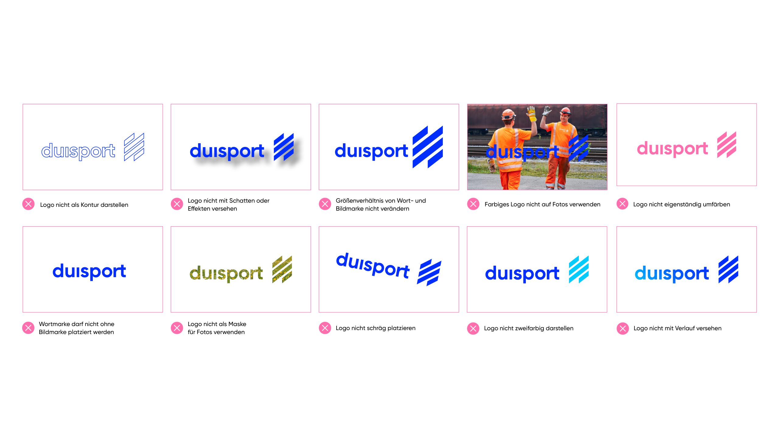
Don’ts
The logo must not be distorted, rotated, or altered in its proportions. Colors must not be modified, and elements must not be moved or removed. Effects, outlines, or additional graphic elements are not permitted.